import matplotlib.pyplot as plt
import numpy as np
import pandas as pd
import yfinance as yfMcKinney Chapter 5 - Practice - Sec 02
FINA 6333 for Spring 2025
%precision 4
pd.options.display.float_format = '{:.4f}'.format
# %config InlineBackend.figure_format = 'retina'
Announcements
- Please keep forming groups on Canvas > People > Projects. If you want a group with more than four students, please fill a group with four students, then email with the group number and size.
- Please keep proposing and voting for students’ choice topics here.
Five-Minute Review
The pandas package makes it easy to manipulate panel data and we will use it all semester. Its name is an abbreviation of panel data:
In statistics and econometrics, panel data and longitudinal data[1][2] are both multi-dimensional data involving measurements over time. Panel data is a subset of longitudinal data where observations are for the same subjects each time.
We will download some financial data from Yahoo! Finance to cover three important tools in pandas.
First, we can use the yfinance package to easily download stock data from Yahoo! Finance.
Note
Starting with version 0.2.51, the yfinance package changed the default behavior of the auto_adjust argument from False to True. By default, the yf.download() function now returns adjusted prices, without including the Adj Close column.
We prefer to work with raw data from Yahoo! Finance and explicitly calculate returns using the Adj Close column. Therefore, we will set auto_adjust=False in our yf.download() calls. See the yfinance changelog for release version 0.2.51.
Also, I will use the progress=False argument to improve the readability of the PDF and website I render from these notebooks.
df0 = yf.download(tickers='AAPL MSFT', auto_adjust=False, progress=False)df0| Price | Adj Close | Close | High | Low | Open | Volume | ||||||
|---|---|---|---|---|---|---|---|---|---|---|---|---|
| Ticker | AAPL | MSFT | AAPL | MSFT | AAPL | MSFT | AAPL | MSFT | AAPL | MSFT | AAPL | MSFT |
| Date | ||||||||||||
| 1980-12-12 | 0.0987 | NaN | 0.1283 | NaN | 0.1289 | NaN | 0.1283 | NaN | 0.1283 | NaN | 469033600 | NaN |
| 1980-12-15 | 0.0936 | NaN | 0.1217 | NaN | 0.1222 | NaN | 0.1217 | NaN | 0.1222 | NaN | 175884800 | NaN |
| 1980-12-16 | 0.0867 | NaN | 0.1127 | NaN | 0.1133 | NaN | 0.1127 | NaN | 0.1133 | NaN | 105728000 | NaN |
| 1980-12-17 | 0.0889 | NaN | 0.1155 | NaN | 0.1161 | NaN | 0.1155 | NaN | 0.1155 | NaN | 86441600 | NaN |
| 1980-12-18 | 0.0914 | NaN | 0.1189 | NaN | 0.1194 | NaN | 0.1189 | NaN | 0.1189 | NaN | 73449600 | NaN |
| ... | ... | ... | ... | ... | ... | ... | ... | ... | ... | ... | ... | ... |
| 2025-02-24 | 247.1000 | 404.0000 | 247.1000 | 404.0000 | 248.8600 | 409.3700 | 244.4200 | 399.3200 | 244.9300 | 408.5100 | 51326400 | 26443700.0000 |
| 2025-02-25 | 247.0400 | 397.9000 | 247.0400 | 397.9000 | 250.0000 | 401.9200 | 244.9100 | 396.7000 | 248.0000 | 401.1000 | 48013300 | 29387400.0000 |
| 2025-02-26 | 240.3600 | 399.7300 | 240.3600 | 399.7300 | 244.9800 | 403.6000 | 239.1300 | 394.2500 | 244.3300 | 398.0100 | 44433600 | 19619000.0000 |
| 2025-02-27 | 237.3000 | 392.5300 | 237.3000 | 392.5300 | 242.4600 | 405.7400 | 237.0600 | 392.1700 | 239.4100 | 401.2700 | 41153600 | 21127400.0000 |
| 2025-02-28 | 241.8400 | 396.9900 | 241.8400 | 396.9900 | 242.0900 | 397.6300 | 230.2000 | 386.5700 | 236.9500 | 392.6600 | 56796200 | 32826500.0000 |
11144 rows × 12 columns
Second, we can slice rows and columns two ways: by integer locations with .iloc[] and by labels with .loc[]
df0.iloc[:6, :6]| Price | Adj Close | Close | High | |||
|---|---|---|---|---|---|---|
| Ticker | AAPL | MSFT | AAPL | MSFT | AAPL | MSFT |
| Date | ||||||
| 1980-12-12 | 0.0987 | NaN | 0.1283 | NaN | 0.1289 | NaN |
| 1980-12-15 | 0.0936 | NaN | 0.1217 | NaN | 0.1222 | NaN |
| 1980-12-16 | 0.0867 | NaN | 0.1127 | NaN | 0.1133 | NaN |
| 1980-12-17 | 0.0889 | NaN | 0.1155 | NaN | 0.1161 | NaN |
| 1980-12-18 | 0.0914 | NaN | 0.1189 | NaN | 0.1194 | NaN |
| 1980-12-19 | 0.0970 | NaN | 0.1261 | NaN | 0.1267 | NaN |
df0.loc[:'1980-12-19', :'High']| Price | Adj Close | Close | High | |||
|---|---|---|---|---|---|---|
| Ticker | AAPL | MSFT | AAPL | MSFT | AAPL | MSFT |
| Date | ||||||
| 1980-12-12 | 0.0987 | NaN | 0.1283 | NaN | 0.1289 | NaN |
| 1980-12-15 | 0.0936 | NaN | 0.1217 | NaN | 0.1222 | NaN |
| 1980-12-16 | 0.0867 | NaN | 0.1127 | NaN | 0.1133 | NaN |
| 1980-12-17 | 0.0889 | NaN | 0.1155 | NaN | 0.1161 | NaN |
| 1980-12-18 | 0.0914 | NaN | 0.1189 | NaN | 0.1194 | NaN |
| 1980-12-19 | 0.0970 | NaN | 0.1261 | NaN | 0.1267 | NaN |
Note
To slice a DataFrame:
- Use
['Name']to select specific columns by their names. - Use
.loc[]to slice rows, or rows and columns together, with labels or conditional expressions.
df0['High']| Ticker | AAPL | MSFT |
|---|---|---|
| Date | ||
| 1980-12-12 | 0.1289 | NaN |
| 1980-12-15 | 0.1222 | NaN |
| 1980-12-16 | 0.1133 | NaN |
| 1980-12-17 | 0.1161 | NaN |
| 1980-12-18 | 0.1194 | NaN |
| ... | ... | ... |
| 2025-02-24 | 248.8600 | 409.3700 |
| 2025-02-25 | 250.0000 | 401.9200 |
| 2025-02-26 | 244.9800 | 403.6000 |
| 2025-02-27 | 242.4600 | 405.7400 |
| 2025-02-28 | 242.0900 | 397.6300 |
11144 rows × 2 columns
# # KeyError: '1980-12-12'
# df0['1980-12-12']
Note, if we use string labels, like dates and words, pandas includes left and right edges! This string label behavior differs from the integer location behavior everywhere else in Python. However, it is easy to figure out the sequence of integer locations. It is difficult to figure our the sequence of string labels.
Third, there many methods we can apply to pandas objects (and chain)! At this point in the course, our most common methods will be:
.pct_change()to calculate simple returns from adjusted close prices.plot()to quickly plot pandas objects.mean(),.std(),.describe(), etc. to calculate summary statistics
(
    df0  # DataFrame containing AAPL and MSFT data from 1980-12-12 through today
    .loc['1990':'2024', 'Adj Close']  # Slice rows for 1990-2024 (inclusive) and the 'Adj Close' column
    .pct_change()  # Calculate daily percentage changes in 'Adj Close' (includes dividends and splits)
    .add(1)  # Prepare for compounding by adding 1 to daily returns
    .cumprod()  # Compute cumulative product to get total return for each day since the start
    .sub(1)  # Convert back to cumulative returns
    .plot()  # Plot cumulative returns
)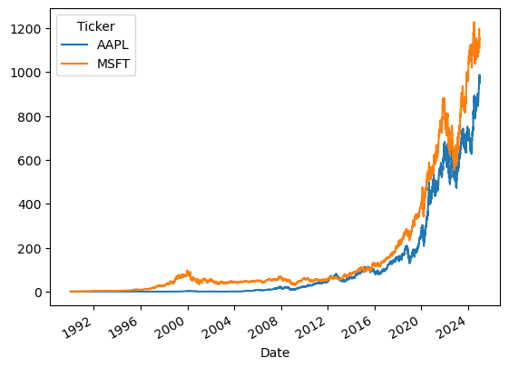
The plot above is in decimal returns! pandas makes it easy to generate plots, but getting them beautiful and readable takes more work. The following code adds a title, labels, and formats the y axis.
from matplotlib.ticker import FuncFormatter

# Plot the data
ax = df0.loc['1990':'2024', 'Adj Close'].pct_change().add(1).cumprod().sub(1).plot()

# Format y-axis as percentages with comma separators
ax.yaxis.set_major_formatter(FuncFormatter(lambda x, _: f'{x*100:,.0f}'))

# Add labels and title if needed
plt.ylabel('Cumulative Return (%)')
plt.title('Cumulative Returns from 1990 to 2024')

# Show the plot and suppress text output (<Axes: xlabel='Date'> above)
plt.show()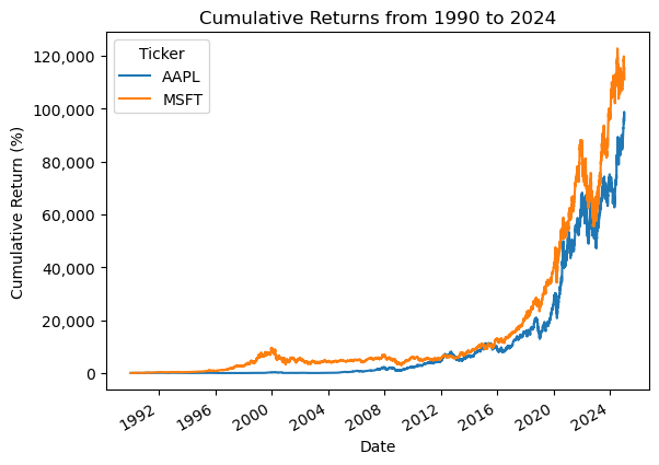
Practice
What are the mean daily returns for these four stocks?
tickers = 'AAPL IBM MSFT GOOG'returns = (
yf.download(tickers=tickers, auto_adjust=False, progress=False)
['Adj Close']
.iloc[:-1]
.pct_change()
)
returns| Ticker | AAPL | GOOG | IBM | MSFT |
|---|---|---|---|---|
| Date | ||||
| 1962-01-02 | NaN | NaN | NaN | NaN |
| 1962-01-03 | NaN | NaN | 0.0087 | NaN |
| 1962-01-04 | NaN | NaN | -0.0100 | NaN |
| 1962-01-05 | NaN | NaN | -0.0197 | NaN |
| 1962-01-08 | NaN | NaN | -0.0188 | NaN |
| ... | ... | ... | ... | ... |
| 2025-02-21 | -0.0011 | -0.0271 | -0.0123 | -0.0190 |
| 2025-02-24 | 0.0063 | -0.0021 | 0.0015 | -0.0103 |
| 2025-02-25 | -0.0002 | -0.0211 | -0.0157 | -0.0151 |
| 2025-02-26 | -0.0270 | -0.0151 | -0.0074 | 0.0046 |
| 2025-02-27 | -0.0127 | -0.0257 | -0.0102 | -0.0180 |
15896 rows × 4 columns
(
    returns # daily returns from 1962 through today
    .dropna() # drop days with incomplete returns
    .iloc[:-1] # drop today, which is likely a partial-day return
    .mean() # calculate mean of daily returns from GOOG IPO through yesterday
)
Ticker
AAPL 0.0014
GOOG 0.0010
IBM 0.0004
MSFT 0.0008
dtype: float64What are the standard deviations of daily returns for these four stocks?
(
    returns # daily returns from 1962 through today
    .dropna() # drop days with incomplete returns
    .iloc[:-1] # drop today, which is likely a partial-day return
    .std() # calculate standard deviation (volatility) of daily returns from GOOG IPO through yesterday
)
Ticker
AAPL 0.0204
GOOG 0.0193
IBM 0.0144
MSFT 0.0170
dtype: float64What are the annualized means and standard deviations of daily returns for these four stocks?
ann_means = (
    returns # daily returns from 1962 through today
    .dropna() # drop days with missing returns
    .iloc[:-1] # drop today, which is likely a partial-day return
    .mean() # calculate mean of daily returns from close of GOOG IPO through yesterday
    .mul(252) # means grow linearly with time, so multiply by 252
)

ann_means
Ticker
AAPL 0.3577
GOOG 0.2541
IBM 0.1119
MSFT 0.1909
dtype: float64ann_stds = (
returns # daily returns from 1962 through today
.dropna() # drop days with incomplete returns
.iloc[:-1] # drop today, which is likely a partial-day return
.std() # calculate mean of daily returns from close of GOOG IPO through yesterday
.mul(np.sqrt(252)) # variances grow linearly with time, so standard deviations grow sqrt(T), so multiply by sqrt(252)
)
ann_stdsTicker
AAPL 0.3234
GOOG 0.3060
IBM 0.2282
MSFT 0.2693
dtype: float64Plot annualized means versus standard deviations of daily returns for these four stocks
Here is a crude plot!
plt.scatter(x=ann_stds, y=ann_means)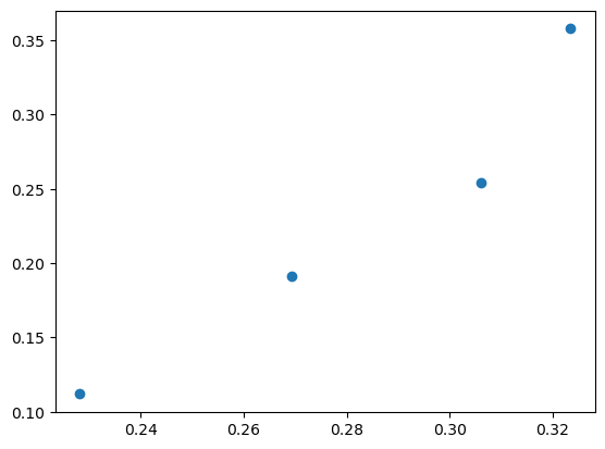
But we can do better than a crude plot! We will typically combine data into a data frame to make plotting easier. Because ann_std and ann_means are pandas’ series, so we can use pd.DataFrame to combine them into a data frame.
df = pd.DataFrame({'Volatility': ann_stds, 'Mean Return': ann_means})

df| Volatility | Mean Return | |
|---|---|---|
| Ticker | ||
| AAPL | 0.3234 | 0.3577 |
| GOOG | 0.3060 | 0.2541 |
| IBM | 0.2282 | 0.1119 |
| MSFT | 0.2693 | 0.1909 |
Note
Below, we could use enumerate() instead of .iterrows(). However, enumerate() loops over column names instead of row indexes and contents. Therefore, with enumerate(), we would have to .transpose() our data frame, then use the tickers to slice the rows of our original data frame. Here iterrows() combines these several steps into one.
ax = df.plot(kind='scatter', x='Volatility', y='Mean Return')

for s, (v, mr) in df.iterrows():
    plt.text(s=s, x=v, y=mr)

ax.xaxis.set_major_formatter(FuncFormatter(lambda x, _: f'{x*100:,.0f}'))
ax.yaxis.set_major_formatter(FuncFormatter(lambda x, _: f'{x*100:,.0f}'))

plt.ylabel('Annualized Mean of Daily Returns (%)')
plt.xlabel('Annualized Volatility of Daily Returns (%)')

plt.title('Return versus Risk for Tech Stocks')
plt.show()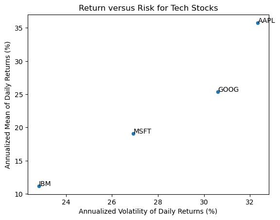
Repeat the previous calculations and plot for the stocks in the Dow-Jones Industrial Index (DJIA)
We can find the current DJIA stocks on Wikipedia. We must download new data, into tickers_2, data_2, and returns_2.
url_2 = 'https://en.wikipedia.org/wiki/Dow_Jones_Industrial_Average'
wiki_2 = pd.read_html(io=url_2)type(wiki_2)listtickers_2 = wiki_2[2]['Symbol'].to_list()data_2 = yf.download(tickers=tickers_2, auto_adjust=False, progress=False)returns_2 = (
data_2
['Adj Close']
.iloc[:-1]
.pct_change()
.dropna()
)df_2 = pd.DataFrame({
'Volatility': returns_2.std().mul(np.sqrt(252)),
'Mean Return': returns_2.mean().mul(252)
})dates_2 = returns_2.indexdates_2[0]Timestamp('2008-03-20 00:00:00')dates_2[-1]Timestamp('2025-02-27 00:00:00')ax = df_2.plot(kind='scatter', x='Volatility', y='Mean Return')
for s, (v, mr) in df_2.iterrows():
plt.text(s=s, x=v, y=mr)
dates_2 = returns_2.index
ax.xaxis.set_major_formatter(FuncFormatter(lambda x, _: f'{x*100:,.0f}'))
ax.yaxis.set_major_formatter(FuncFormatter(lambda x, _: f'{x*100:,.0f}'))
plt.ylabel('Annualized Mean of Daily Returns (%)')
plt.xlabel('Annualized Volatility of Daily Returns (%)')
plt.title(f'Return versus Risk for DJIA Stocks\nfrom {dates_2[0]:%B %Y} to {dates_2[-1]:%B %Y}')
plt.show()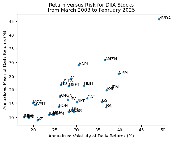
We can use the seaborn package to add a best-fit line! More on seaborn here: https://seaborn.pydata.org/index.html
import seaborn as snssns.regplot(
data=df_2,
x='Volatility',
y='Mean Return'
)
for s, (v, mr) in df_2.iterrows():
plt.text(s=s, x=v, y=mr)
ax.xaxis.set_major_formatter(FuncFormatter(lambda x, _: f'{x*100:,.0f}'))
ax.yaxis.set_major_formatter(FuncFormatter(lambda x, _: f'{x*100:,.0f}'))
plt.ylabel('Annualized Mean of Daily Returns (%)')
plt.xlabel('Annualized Volatility of Daily Returns (%)')
plt.title(f'Return versus Risk for DJIA Stocks\nfrom {dates_2[0]:%B %Y} to {dates_2[-1]:%B %Y}')
plt.show()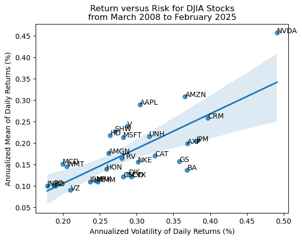
NVDA is a real outlier! We can use the .drop() method to quickly drop NVDA. Theory predicts no relation between \(\mu\) and \(\sigma\) for single stocks because single-stock risk is diversifiable. If we use a larger sample (or a different time period), we would see a flat or negatively sloped best-fit line.
sns.regplot(
    data=df_2.drop('NVDA'),
    x='Volatility',
    y='Mean Return'
)

for s, (v, mr) in df_2.drop('NVDA').iterrows():
    plt.text(s=s, x=v, y=mr)

dates_2 = returns_2.index

ax.xaxis.set_major_formatter(FuncFormatter(lambda x, _: f'{x*100:,.0f}'))
ax.yaxis.set_major_formatter(FuncFormatter(lambda x, _: f'{x*100:,.0f}'))

plt.ylabel('Annualized Mean of Daily Returns (%)')
plt.xlabel('Annualized Volatility of Daily Returns (%)')

plt.title(f'Return versus Risk for DJIA Stocks (Minus NVDA)\nfrom {dates_2[0]:%B %Y} to {dates_2[-1]:%B %Y}')
plt.show()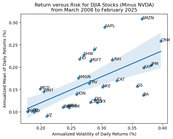
Calculate total returns for the stocks in the DJIA
We can use the .prod() method to compound returns as \(1 + R_T = \prod_{t=1}^T (1 + R_t)\). Technically, we should write \(R_T\) as \(R_{0,T}\), but we typically omit the subscript \(0\).
In general, I prefer to do simple math on pandas objects (data frames and series) with methods instead of operators:
For example:
.add(1)instead of+ 1.sub(1)instead of- 1.div(1)instead of/ 1.mul(1)instead of* 1
The advantage of methods over operators, is that we can easily chain methods without lots of parentheses.
total_returns_2 = returns_2.add(1).prod().sub(1)

ax = total_returns_2.sort_values().plot(kind='barh')

ax.xaxis.set_major_formatter(FuncFormatter(lambda x, _: f'{x*100:,.0f}'))

plt.xlabel('Total Return (%)')

plt.title(f'Total Returns for DJIA Stocks\nfrom {dates_2[0]:%B %Y} to {dates_2[-1]:%B %Y}')
plt.show()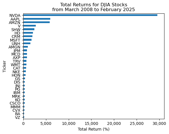
Plot the distribution of total returns for the stocks in the DJIA
We can plot a histogram, using either the plt.hist() function or the .plot(kind='hist') method.
A histogram is a great way to visualize data!
ax = total_returns_2.plot(kind='hist')

ax.xaxis.set_major_formatter(FuncFormatter(lambda x, _: f'{x*100:,.0f}'))

plt.xlabel('Total Return (%)')

plt.title(f'Distribution of Total Returns for DJIA Stocks\nfrom {dates_2[0]:%B %Y} to {dates_2[-1]:%B %Y}')
plt.show()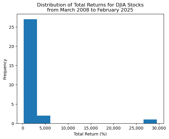
Which stocks have the minimum and maximum total returns?
If we want the values, the .min() and .max() methods are the way to go!
total_returns_2.min()2.1510total_returns_2.max()295.7450The .min() and .max() methods give the values but not the tickers (or index). We use the .idxmin() and .idxmax() to get the tickers (or index).
total_returns_2.idxmin()'VZ'total_returns_2.idxmax()'NVDA'Here is what I would use to capture values and tickers!
total_returns_2.sort_values().iloc[[0, -1]]Ticker
VZ 2.1510
NVDA 295.7450
dtype: float64Not the exactly right tool here, but the .nsmallest()' and.nlargest()` methods are really useful!
total_returns_2.nsmallest(3)Ticker
VZ 2.1510
BA 2.2134
CVX 2.7258
dtype: float64total_returns_2.nlargest(3)Ticker
NVDA 295.7450
AAPL 59.8113
AMZN 58.4955
dtype: float64Plot the cumulative returns for the stocks in the DJIA
We can use the cumulative product method .cumprod() to calculate the right hand side of the formula above.
ax = (
    returns_2
    .add(1)
    .cumprod()
    .sub(1)
    .plot(legend=False) # with 30 stocks, this legend is too big to be useful
)

ax.yaxis.set_major_formatter(FuncFormatter(lambda x, _: f'{x*100:,.0f}'))

plt.ylabel('Cumulative Return (%)')

plt.title(f'Cumulative Returns for DJIA Stocks\nfrom {dates_2[0]:%B %Y} to {dates_2[-1]:%B %Y}')
plt.show()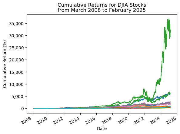
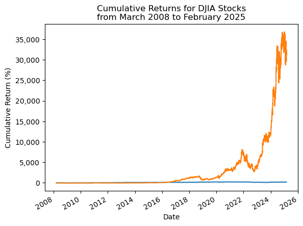
Repeat the plot above with only the minimum and maximum total returns
ax = (
    returns_2
    [total_returns_2.sort_values().iloc[[0, -1]].index] # slice min and max total return stocks
    .add(1)
    .cumprod()
    .sub(1)
    .plot(legend=False) # with 30 stocks, this legend is too big to be useful
)

ax.yaxis.set_major_formatter(FuncFormatter(lambda x, _: f'{x*100:,.0f}'))

plt.ylabel('Cumulative Return (%)')

plt.title(f'Cumulative Returns for DJIA Stocks\nfrom {dates_2[0]:%B %Y} to {dates_2[-1]:%B %Y}')
plt.show()